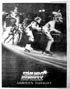
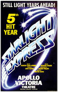
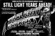
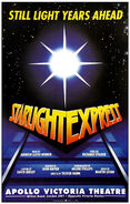
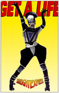
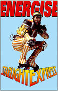
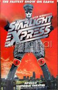
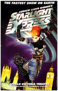
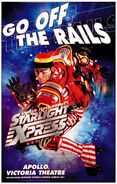
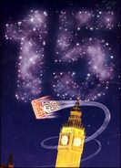
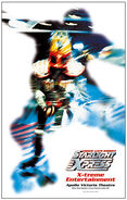
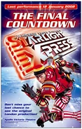
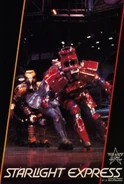
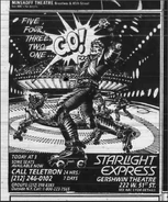
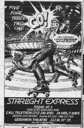
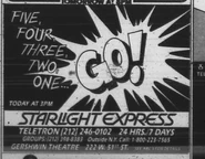
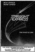
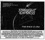
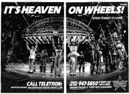
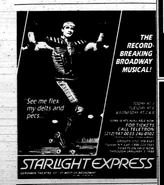
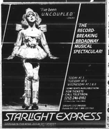
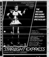
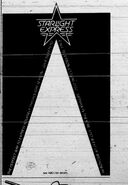
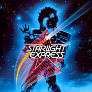
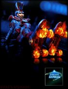
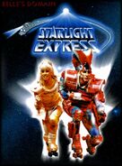
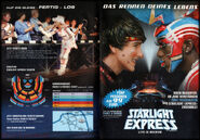
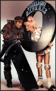
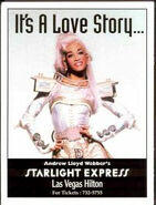
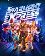
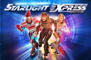
Adverts, Posters, Flyers, used to promote the show throughout its incarnations.
London[]
The original logo, designed by Marcus Bradbury for Dewynters, consisted of two elements - the word art for the title, and the image of a train formed of stars curving in a distinctive "Swoosh" shape. This poster is typical of the iconic designs by Dewynters of the time, such as the "Cats" dancing eyes, or Miss Saigon's helicopter logo.
The Word Art part of the logo soon developed an alternate, eye-catching red and yellow colourway, which became dominant over the original shaded blue version.
By 1989, the Japanese logo concept had influenced the design used in London, with the word art itself forming the suggestion of the train.
in 1992, the show was revamped extensively, and part of this included a new logo. This new form of word art suggests the shape of a snow plough or "cow catcher" on the front of a train. It retained the eye-catching yellow and red colourway used previously.
Around 1996-1997, a new logo was introduced, the block metal word art. The letters are given a three dimensional, metallic finish, with the details suggesting rivets holding them together. Initially this logo was used flat, but in 1998 it was given a dynamic shape, with colouring to suggest the metal glowing with heat, perhaps to suggest enormous speed. This colourful, dynamic version remained in use until the show's closing in 2002.
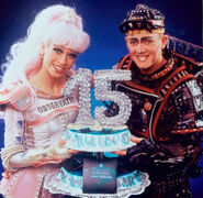
We also had an anniversary campaign for the 15th year, in 1998.
"Silhouette" marketing campaign for the Millennium, a new, fresh, different look for the show's image.
"The Final Countdown" show closing campaign, using images of characters from around 1995.
Broadway[]
The Broadway transfer of Starlight Express used a new logo - the title was given a clear, italic font and layout, and this was given a background of a Shooting Star - keeping the sweeping feel of the original logo, with its sense of movement and a headlight, but rather than the suggestion of the shape of a train, the Shooting Star gave us brightly coloured star-shaped imagery. This logo went on to appear in later touring productions.
Japan/Australia Tours 1987, 1990[]
The Australian leg of the Japan/Australia tour used the Shooting Star logo from the recently opened Broadway production, and ramped it up by adding the silhouette of Electra to the poster design.
The Japanese productions in 1987 and 1990 however, took a different take on the logo, taking inspiration from the contemporary London designs. This version, which appeared in both silver and gold, uses word art to suggest the shape of the train with the letters. It maintains the iconic swoosh shape familiar in many designs.
Bochum[]
The German production has been remarkably consistent in its use of logos, using the same word art element for all 30 years of production. The earliest version accompanied the word art with a light burst and a figure of a skater; this was soon altered to appear as if the words are projected from the light burst and a swoosh of a train encircled the logo. The additional train element was dropped around 2004-2005, and the current version uses a light burst and the sense of projection, without any overt "Train" or mechanical elements.
Logos
Key Visuals - the Key Visual is the German production's main image for the year, used in posters, adverts, and usually as the cover for the souvenir program.
Adverts
Anniversaries
US Tour 1989[]
The first US Tour was a direct descendant of the Broadway show, and used the colourful Shooting Star logo, simply adding the caption "Tracking Across America".
Las Vegas 1993 - 1997[]
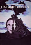
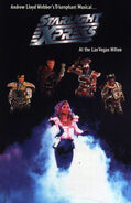
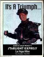
The Las Vegas production used several logos and advertising campaigns through its years. Initially the production used a pictorial image of a human face transposed onto a photograph of a steam train, accompanied by a simple text title. However this image was found to be particularly disturbing for children, and its use was dropped. Later during the production the block metal London logo was used as a more distinctive alternative to the simple text title.
US Tour 2003[]
The US Tour used the heavy block metal logo first used in London in the mid-1990s. They also made use of models in costume as Rusty and Pearl for early promotional material.
UK Tour 2004 - 2008[]
The 2004 Production gave us a new, updated, and somewhat generic logo. While it is a pleasing design, it lacks the additional inferred context that earlier designs could convey. Early tour advertising material used older London character images - including Bobo and Espresso who were not included in the touring production!
New Zealand Tour 2009[]
The New Zealand tour was effectively an extension of the UK Tour, and used the same graphics.
UK Tour 2012[]
The 2012 Kenwright tour abandoned the earlier tour logo, in favour of using an updated version of the block metal logo used in the later years of the London production. This logo is also licensed for Amateur productions.
2017 Workshop[]
The 2017 Workshop used an updated version of the original 1984 London logo, however they also used the more common block metal logo on internal scripts etc.


